Threshold Examples for WCAG 2.3.1 Three Flashes or Below
Particular color/brightness, visual field/screen area, number, and frequency of flash thresholds must all be met or exceeded for WCAG 2.3.1 Three Flashes or Below Threshold (A) to be non-conformant. The content below attempts to make these thresholds more concrete by providing visual examples, so that it is easier to recognize 2.3.1 issues.
While the Photosensitive Epilepsy Analysis Tool (PEAT) software can determine conformance with true precision, these visual examples may allow someone to quickly intuit whether or not flashing content exceeds the 2.3.1 thresholds, without having to use a tool.
It is always prudent to err on the side of caution and cite potential non-conformance, since 2.3.1 is one of four WCAG SCs non-conformance to which is considered to interfere with usage of a page. In fact, WCAG 2.3.1 is a complete show-stopper, the only SC at A or AA Level non-conformance to which may cause immediate physical harm to a user. (In 2014, the Epilepsy Foundation estimated that there are around 900,000 people in the US who may be affected by photosensivity.)
Area Threshold
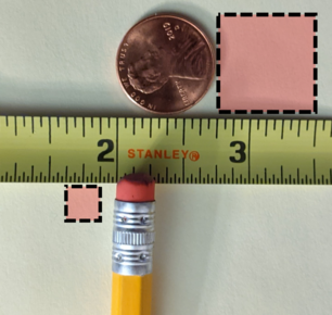
The image above provides a visual correlative for the WCAG “general flash and red flash thresholds” area calculation, which says “the combined area of flashes occurring concurrently [must occupy] no more than a total of … 25% of any 10 degree visual field on the screen … at typical viewing distance.”
Using a visual angle calculator, if we take a moderate viewing distance of 17 inches — about the distance to the screen when working on a laptop, close up — and a very close viewing distance of 5½ inches — what might be experienced when holding a mobile device screen exceptionally close and squinting at small text — ¾ inch square and ¼ inch square occupy 25% of the 10° visual field for each distance, respectively. (See this study of how sleep is affected by computer screen usage, for distances approximating our benchmarks for close viewing of laptop and mobile screens.)
This means that in order for the area threshold reasonably to be met, and for a page potentially to be 2.3.1 non-conforming, at least ¼ inch square of the screen perceived to be in the center of your vision must be flashing.
Though ¼ inch square is not much, it is generally more area than is cumulatively occuppied by the colored area of a typical circular loading spinner or a pulsing dots loading animation. And while so-called “skeleton loaders” always occupy much more screen area, they rarely meet the frequency threshold — that is, a skeleton loader flashing at a rate exceeding three times in a second would almost certainly be considered exceptionally poor design.
MDN's excellent accessibility article on colors and lumninance contains a section on flashing and seizures, which gives size estimates that are around double my estimates above. The calculations above should be considered conservative.
Frequency and Number Threshold
The very small (below area threshold) square below will cycle between green and gray (an above color threshold color pair) at a frequency slightly slower than the threshold three times in a second — it cycles 2.5 times in a second, actually.
Clicking the “Start (almost) flashing” button below the square will start it cycling. Clicking again will toggle it stopped. Warning: Even though in this example we are falling below some of the thresholds that may induce a seizure in people who are photosensitive, do not click the button unless you are sure your audience will not be affected.
If something cycles colors at least three times (e.g., dark-light-dark-light-dark-light) and the rapidity of the cycling is any faster than what you see above, the page containing the element(s) may be non-conformant with 2.3.1.
Color Threshold
Swatches below show samples of the saturation, contrast, and hue differences necessary to meet or exceed the minimum color thresholds for WCAG 2.3.1.
Gradient showing the range of saturated reds (from 20 through 0 to 340 degrees). For “red flash”, the flashing must be between a saturated red and another color.
Saturated red and 20% darker red (at 2.3.1. red threshold). “Red flash” can involve a contrast difference of a saturated red and the same color at a 20% lesser luminance.
Saturated red, red plus 30 degrees, and green/120 degrees (at 2.3.1 red thresholds). “Red flash” can involve a hue difference. The orangish color is 10 degrees past the limit for what is considered a red and 30 degrees from the saturated red and therefore cycling between the red and the orangish color could be considered flashing.
Saturated red, red minus 30 degrees, and blue/240 degrees (at 2.3.1 red thresholds). The pinkish color is 10 degrees past the limit for what is considered a red and 30 degrees from the saturated red and therefore cycling between the red and the pinkish color could be considered flashing.
Black 20 and 30 percent (at 2.3.1 relative luminance threshold). “General flash” can involve a brightness contrast/relative luminance difference. A 10% difference is adequate for the luminance threshold to be met.
Black 50 and 60 percent (at 2.3.1 relative luminance threshold). A 10% difference is adequate for the luminance threshold to be met.
Black 0 and 10 percent (below relative luminance for 2.3.1 threshold). For “general flash,” while only a 10% contrast difference is necessary, the darker color must be at least 20% bright/light.